


Neutral palette choices for a minimalist living room focus on subdued hues, balanced contrast, and layered textures to create calm, cohesive interiors. A neutral palette blends shades like warm beiges, cool grays, soft whites, and muted taupes to establish a serene backdrop that supports minimalist design and flexible styling.
Using a neutral palette matters because it simplifies decision-making, increases perceived space, and improves resale appeal while allowing statement pieces to stand out. This article explores selection strategies, pairing techniques, material choices, lighting considerations, and practical steps to implement a neutral palette in a minimalist living room.
Read on for actionable guidance, comparison tables, pros and cons, quantitative references, and a focused FAQ to help you plan, choose, and apply a neutral palette with clarity and confidence.
Neutral palette fundamentals
Core definitions and scope
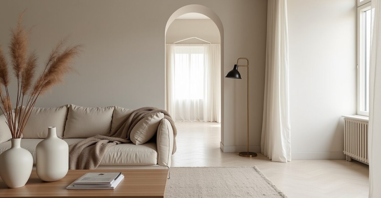
A neutral palette refers to a coordinated set of colors that sit near the center of the color wheel—whites, grays, beiges, taupes, and muted browns—used to create understated, versatile interiors. In a minimalist living room, a neutral palette defines spatial boundaries without competing for attention, allowing form and texture to dominate. This approach prioritizes tonal harmony, enabling furniture, light, and architecture to become focal points while maintaining a calm atmosphere.
Neutrals act as a stable visual foundation: they reduce clutter perception, improve light diffusion, and enhance the impact of chosen accents. Designers often layer multiple neutrals at varying values to build depth and avoid flatness. The goal is effortless cohesion—colors that work together across walls, floors, textiles, and decor.
Understanding the scope of neutrals helps you make decisions about contrast, undertones, and finish; these elements drive whether a space feels warm, cool, modern, or timeless. Thoughtful neutral selection supports longevity and easy refreshes without full renovations.
Key terms and color relationships
Undertone, value, saturation, and temperature are essential when working with a neutral palette. Undertone (warm vs. cool) influences how a beige or gray reads in natural light, while value indicates a color’s lightness or darkness. Saturation (intensity) in neutrals is typically low, which encourages subtle interplay between textures and surfaces. Temperature—warm neutrals (creamy beiges, warm taupes) versus cool neutrals (slate grays, greige)—guides mood and pairing choices.
Complementary relationships are less about hue contrast and more about contrast of value and finish: matte plaster walls against semi-gloss trim, or a high-pile rug against a smooth leather sofa. These relational choices create visual interest even when the hue range is narrow. Recognizing these terms helps you translate inspiration photos into real-world paint, fabric, and finish selections.
Pay attention to how natural and artificial light shifts these relationships through the day. A neutral that reads warm at noon may look cooler under LED bulbs; swatch testing under multiple lighting conditions is crucial to get predictable results.
Common misconceptions
Many assume a neutral palette equals boring or monochrome—but in reality it can be deeply layered and richly textured while remaining restrained. Another misconception is that neutrals are only for high-end or Scandinavian styles; they’re adaptable to rustic, transitional, or eclectic approaches when paired with the right materials and accents. Finally, some believe neutrals hide dirt or age poorly; selecting appropriate materials and finishes (durable fabrics, washable paints) counters these concerns.
Neutral schemes can also be mistaken for low-contrast designs that lack focal points; the solution is deliberate contrast through scale, texture, and selective color accents. Properly executed, a neutral palette enhances perceived space, improves natural light reflection, and extends longevity of décor choices.
Clarifying these misconceptions helps homeowners and designers commit confidently to a neutral approach without fearing blandness or impracticality.
- Balance temperature: match warm or cool undertones across walls and major furniture.
- Layer values: combine light, mid, and dark neutrals to create depth.
- Prioritize texture: use textiles and finishes to add interest without color.
- Test in context: swatch paints and fabrics in multiple lights before finalizing.
Neutral palette pairing strategies
Contrast through value and texture
When color variety is limited, value contrast becomes the primary tool for visual hierarchy. Pair a pale off-white wall with a mid-gray sofa and a charcoal rug to create clear spatial zones. Textures—wool, linen, brushed metal, matte plaster—amplify contrast by catching light differently, which provides perceived complexity in a restrained palette. Designers often use three-tier value systems: light backgrounds, mid-tone furniture, and darker accents to anchor the space.
Mixing smooth and textured surfaces prevents flatness; for example, a smooth painted wall complements a boucle chair and a reclaimed-wood coffee table. Value contrast also helps delineate furniture clusters in open-plan living rooms without relying on color.
Execute this by choosing one dominant neutral, one supporting mid-tone, and one accent neutral for depth. This method reduces decision fatigue and guarantees a balanced minimalist aesthetic.
Accents and restrained color pops
Introduce subtle color pops—olive green, muted terracotta, or dusty blue—sparingly to preserve a neutral palette’s integrity while providing focal interest. Use accents through small objects or textiles, such as a single throw pillow, a ceramic vase, or a framed print. These restrained pops should have low chroma to stay harmonious; saturated hues can break the minimalist tone.
Accents can also serve functional roles: a colored ottoman can act as a visual anchor and occasional extra seating. Keep a limited palette of 1–2 accent tones and repeat them in different materials to create cohesion without overwhelming neutrality.
Strategic accent placement—near a natural focal point like a fireplace or window—ensures the eye is drawn in a controlled way, complementing the neutral palette rather than competing with it.
Coordinating metals, woods, and finishes
Metal and wood tones should align with the neutral palette’s temperature: warm neutrals pair with brass, oak, and honeyed woods; cool neutrals pair with chrome, matte black, and ash. Mixing metals is acceptable when you maintain a consistent temperature or intentionally use contrast as a design choice. Finishes (matte, satin, gloss) also affect perception—matte surfaces feel softer and modern, while satin adds subtle reflection and formality.
For a cohesive minimalist living room, pick a dominant finish (e.g., matte black hardware) and echo it in lighting and small accents. Wood grain selection—smooth, fine-grain versus rustic—should match the room’s formality.
These coordinated choices create an integrated visual language where materials and finishes read as intentional elements of the neutral palette rather than disparate bits of décor.
- Assess: Evaluate natural light, room size, and fixed finishes like flooring.
- Select: Choose a dominant neutral base (wall and large surfaces) first.
- Layer: Add mid-tones in furniture and darker tones in anchors like rugs.
- Test: Place swatches and samples in situ across different times of day.
- Commit: Finalize paints and fabrics, then add accents and art sparingly.
Neutral palette color selection and samples
Choosing base paints and undertones
Selecting a base paint is foundational: aim for a color that reads consistently across morning sunlight and evening artificial light. Warm undertones (yellow, red) create coziness, while cool undertones (blue, green) foster a crisp, airy feeling. Test large swatches on different walls—colors can shift up to two full values depending on adjacent surfaces. Consider light reflectance value (LRV): whites with LRV 70–85 brighten spaces, while LRVs below 50 create intimacy.
Neutral palette success hinges on matching undertones between wall paint and trim; mismatches create visual tension. Many designers recommend choosing trim one or two shades lighter than walls to provide subtle contrast without harsh lines.
Bring physical samples home and view them over several days; digital images rarely capture undertone subtleties required for a polished neutral palette implementation.
Fabric and upholstery swatches
When sourcing fabrics, consider durability ratings and cleanability alongside color: performance linens or synthetic blends in neutral tones offer longevity without sacrificing aesthetic. Swatches must be evaluated against the chosen wall color and flooring to ensure undertones align. Patterned neutrals—herringbone, subtle plaids, tone-on-tone ikat—add depth without introducing competing hues. For seating, choose mid-tone neutrals to mask wear; for pillows and throws, lighter or darker neutrals can provide visual layering.
Order multiple swatches and place them near light sources to assess drift. Check rub counts and care instructions for upholstery to predict maintenance needs. Selecting textiles strategically ensures the neutral palette remains comfortable and practical.
Neutral upholstery in a high-traffic living room often benefits from stain-resistant finishes and removable covers, which extend the life of the design while preserving minimalist intentions.
Rug and floor pairings
The floor anchors the room: choose rugs and floor finishes that complement the neutral palette by contrasting value and adding texture. A natural fiber rug in a warm beige can warm cool gray walls; a low-pile patterned rug with 10–15% darker tones introduces subtle pattern without overwhelming minimalism. Consider scale: large-format rugs create unified zones, while smaller rugs can fragment the space.
Flooring choices—light oak, polished concrete, or charcoal tile—set the baseline for the palette’s temperature. Maintain 20–30% contrast between floor tone and major furniture to ensure pieces don’t visually disappear. Layer rugs for texture and dimensionality when appropriate.
Balance practicality and aesthetics: durable, low-pile rugs are easier to maintain in family living rooms, while textured high-pile rugs bring warmth to low-traffic minimalist spaces.
| Option | Best For | Visual Effect |
|---|---|---|
| Light warm beige walls | Small rooms, low natural light | Feels cozy, expands perceived space |
| Cool mid-gray walls | Modern minimalism, high light | Creates crisp, airy backdrop |
| Greige (gray+beige) | Transitional styles | Neutral compromise, versatile |
| Soft white walls | Gallery-like, high-contrast decor | Bright, clean, reflective |
Material choices and practical implementation
Textiles, finishes, and maintenance
Material choices define the tactile experience of a neutral palette: linen, wool, cotton, leather, and natural fibers each contribute distinct textures that enhance depth. Select finishes that are easy to maintain—performance fabrics for upholstery, washable cushion covers, and stain-resistant rugs in high-use areas. Matte paint finishes reduce glare and hide imperfections, while satin or semi-gloss can highlight architectural details such as trim and built-ins.
Maintenance considerations should guide material selection: a lighter neutral may require more frequent cleaning, so choose durable, treatable fabrics for seating. For a minimalist living room, keep cleaning protocols simple and consistent to preserve the restrained aesthetic over time.
Incorporate surface protection—area rugs under furniture legs, washable slipcovers, and protective finishes on wood—to maintain the neutral palette’s fresh appearance without sacrificing comfort or function.
Lighting integration and color temperature
Lighting dramatically affects how a neutral palette reads. Warm 2700–3000K lighting will enhance warm neutrals and create a cozy atmosphere, while 3500–4100K cooler lighting keeps cool neutrals crisp and modern. Use layered lighting—ambient, task, and accent—to control mood and emphasize texture. Dimmers offer flexibility, allowing you to tweak warmth and contrast throughout the day. Natural light should be maximized with light window treatments that diffuse rather than block illumination.
Placement matters: uplighting and floor lamps soften shadows on textured walls, while directional pendants can highlight focal furniture pieces. Consider energy efficiency and bulb CRI (Color Rendering Index); CRI above 90 preserves subtle neutral undertones most accurately.
Test bulbs in the actual living room before finalizing fixtures; the same bulb can alter perceived wall color significantly, so plan lighting choices in tandem with paint and textiles.
Durability and longevity considerations
Neutral palettes often aim for timelessness, so durability is key: choose high-quality finishes and strong joinery for furniture, and prioritize fabrics with high abrasion resistance for seating. Investment pieces—sofas, armchairs, and area rugs—should balance aesthetic neutrality with longevity through replaceable components and professional cleaning compatibility. Consider lifecycle costs: cheaper materials may need replacement in 3–5 years versus durable alternatives lasting 10–20 years.
Segundo Consumer Reports, durable upholstery with high rub counts can extend furniture life by up to 50% compared to low-rated fabrics, reducing long-term costs. Factor long-term maintenance—stain treatments, reupholstery—into your budget for a sustainable neutral design.
Thoughtful procurement reduces waste, preserves the minimalist aesthetic, and ensures your neutral palette remains fresh and functional over time.
- High-quality fabrics increase lifespan and reduce replacement frequency.
- Matte finishes hide imperfections and require less frequent touch-ups.
- Protect floors and textiles to prevent premature wear.
- Choose bulbs with CRI >90 to render neutrals accurately.
- Plan for replaceable components to adapt the palette over time.
Advantages of a neutral palette in minimalist living rooms
Psychological and aesthetic benefits
A neutral palette fosters calmness and reduces visual noise, which supports relaxation and focus—key goals of minimalist interiors. Neutrals allow architectural features and curated objects to stand out without competing for attention. A restrained color scheme also creates continuity throughout open-plan homes, improving flow and perceived spaciousness. These psychological benefits are why many designers recommend neutrals for living spaces intended for frequent use and long-term satisfaction.
Neutral palettes are visually flexible, easily adapting to seasonal décor swaps and evolving tastes. Their subtlety emphasizes materiality and silhouette, rewarding attention to proportion and craftsmanship. For households seeking lasting appeal, neutrals deliver understated elegance without rapid obsolescence.
Segundo Architectural Digest, neutral interiors consistently rank among the top design trends cited by designers for longevity and resale appeal.
Economic and resale advantages
Neutral palette homes tend to perform better on the resale market because they allow potential buyers to envision personal customization. Neutral walls and finishes require fewer staging changes and are perceived as lower-risk by buyers and agents. Economically, investing in neutral, durable materials can reduce replacement frequency and maintenance costs over time. These practical savings compound when choices are coordinated to be timeless rather than trend-driven.
Real estate professionals often advise repainting in neutral tones before listing to broaden buyer interest and potentially shorten market time. Neutral schemes are cost-effective when they minimize the need for frequent aesthetic overhauls while maintaining mainstream appeal.
Segundo National Association of Realtors, staged homes with neutral palettes can reduce time on market by up to 10–20% in competitive regions, improving sale outcomes.
Flexibility and adaptability
A neutral palette provides a flexible foundation for seasonal or personal updates without requiring structural changes. Accent pieces, textiles, and art can be rotated to refresh the space. This adaptability supports sustainable design practices: instead of replacing large items, you can update smaller elements to refresh the look. Neutral backgrounds also enable layering—mixing vintage finds with contemporary pieces—without visual conflict.
For renters or homeowners planning gradual renovations, neutrals allow incremental upgrades while maintaining a cohesive aesthetic. They also support multifunctional living rooms that transition between relaxation, work, and entertaining with minimal visual friction.
Strategic neutral choices therefore extend the functional lifespan of interiors and simplify future design changes.
- Creates calm, timeless aesthetics that support relaxation.
- Improves resale appeal and staging outcomes.
- Reduces long-term maintenance and replacement costs.
- Enables easy seasonal or style updates via accents.
- Supports sustainable, incremental design changes.
- Enhances perceived space and architectural clarity.
Limitations and challenges of neutral palettes
Risk of monotony and blandness
A primary challenge with a neutral palette is the potential for monotony if textures, values, and focal points are not thoughtfully introduced. A room that relies solely on a single neutral tone across walls, furniture, and floors can feel flat and uninspiring. To avoid blandness, intentionally layer varied materials and values, incorporate sculptural elements, and introduce one or two low-chroma accents. Balance is essential: repetition of patterns and textures must be managed to create rhythm rather than sameness.
Designers often recommend varying finishes and adding a tactile mix—smooth, nubby, polished—to create visual interest without adding color. Thoughtful editing and restraint prevent neutral schemes from becoming lifeless while maintaining minimalist principles.
Regularly revisiting the arrangement and swapping accents seasonally can keep the space feeling intentional rather than static.
Lighting sensitivity and color shifts
Neutral colors are highly sensitive to lighting conditions; the same paint can read warm or cool depending on light quality and neighboring colors. Inconsistent lighting can create uneven perception across surfaces, complicating cohesion. To mitigate this, test samples in multiple light conditions and consider unified lighting plans with dimmers and bulbs of consistent color temperature. Also be mindful of reflective surfaces that may amplify color shifts and create unintended undertone interactions.
Light sensitivity is especially problematic in rooms with limited natural light, where neutrals may become flat or dull. Introducing layered artificial lighting and reflective accents can counteract this and restore depth to the palette.
Plan lighting and color selection together to achieve predictable and consistent neutral renderings throughout the day.
Maintenance and visible wear
Light neutral surfaces can show wear, stains, and scuffs more readily than darker finishes, posing maintenance challenges in high-traffic living rooms. Upholstery, light rugs, and pale painted trim require more frequent cleaning. Selecting performance fabrics, stain-resistant treatments, and washable cushion covers helps manage upkeep. For flooring and lower surfaces, choose slightly darker mid-tones in problem-prone zones to hide daily wear while keeping overall neutrality intact.
Regular maintenance schedules—spot cleaning, gentle vacuuming, and professional upholstery cleaning every 12–24 months—preserve the neutral palette’s fresh appearance. Proactive protective measures such as area rugs in entryways and armrest covers on sofas reduce visible deterioration.
Budgeting for maintenance and choosing practical materials prevent a neutral palette from becoming an impractical aesthetic choice for busy households.
- Neutrals can feel monotonous without textural and value variation.
- Colors shift with lighting; test samples under multiple conditions.
- Light tones reveal wear faster; plan for maintenance and durable materials.
Practical styling tips and best practices
Curating focal points and art
In a neutral living room, focal points must be deliberate: a large-scale piece of art, a sculptural light fixture, or an architecturally distinct fireplace can provide visual anchors. Choose artwork with restrained palettes or muted contrast to harmonize with the neutral palette. Maintain negative space around focal objects to emphasize their presence, and avoid overcrowding surfaces. When placing art, consider scale (art should occupy 60–75% of furniture width for balance) and sight lines from major seating positions.
Rotation of art seasonally or for refreshes keeps the curated look dynamic without altering the foundational palette. Minimalist styling benefits from curated restraint: fewer objects, higher quality, and considered placement.
Let your focal points tell a coherent story that complements the neutral backdrop and reinforces the living room’s intended mood.
Storage, decluttering, and layout
Minimalist living relies on smart storage solutions to preserve clean sightlines. Built-in shelving with concealed compartments, low-profile media units, and multi-functional furniture (storage ottomans, benches) maintain minimal clutter while aligning with a neutral palette. Layouts should prioritize flow and function: place seating to facilitate conversation and anchor with a centrally located rug. Keep surfaces intentionally edited—group items in threes for visual balance and avoid symmetry that reads too formal.
Use hidden storage to keep everyday items out of view; open shelving should be curated with consistent neutral-toned objects to prevent visual chaos. A decluttering routine helps sustain the minimalist intent and highlights the neutral palette’s elegance.
Function-driven layout combined with disciplined storage solutions supports lasting neatness and aesthetic clarity.
Seasonal updates and low-cost refreshes
Refreshing a neutral palette seasonally is efficient and cost-effective: swap throws, pillows, and small accessories in different textures or low-chroma accents to shift mood. Changing lamp shades, adding a new rug, or rotating plants can renew the space without major expense. Keep a cohesive base so these swaps feel intentional rather than disjointed. For holidays or temporary themes, introduce small, reversible accents that won’t disrupt the overall neutral harmony.
Opt for modular accessories and neutral bases for larger investments; this ensures low-cost, high-impact updates that align with minimalist principles. Catalog and store seasonal items to simplify rotation and maintain a clutter-free environment.
Regular, modest updates extend the life of your neutral palette and sustain occupant satisfaction without costly renovations.
- Curate one or two strong focal points; avoid overcrowding.
- Use concealed storage and multifunctional furniture to reduce clutter.
- Refresh seasonally with textiles and small accessories, not structural changes.
- Prioritize quality pieces and rotate accents for low-cost updates.
- Maintain a decluttering routine to preserve minimalist goals.
Conclusion
A neutral palette offers a strategic, timeless foundation for minimalist living rooms by emphasizing light, texture, and proportion over color complexity. With mindful selection of undertones, layered values, coordinated materials, and intentional focal points, neutral palette schemes can feel warm, modern, or classic while remaining adaptable and low-maintenance. Assess natural light, test materials in-situ, and plan lighting and storage to maximize the palette’s benefits.
Implementing a neutral palette rewards thoughtful restraint: fewer but better pieces, deliberate accents, and careful maintenance yield serene, cohesive interiors that last. Start with a dominant base color, layer mid- and dark-tones, and refine with texture and lighting for a minimalist living room that feels both effortless and deeply considered.
Ready to redesign? Pick your dominant neutral and test samples in your space this week—small trials lead to confident, lasting choices.
Frequently Asked Questions
What is neutral palette?
A neutral palette is a curated set of understated hues—whites, creams, grays, beiges, taupes, and soft browns—used together to create cohesive, calm interiors. It emphasizes tonal harmony, texture, and value contrast rather than saturated color. In practice, a neutral palette supports minimalist design by simplifying visual complexity, enhancing light and space perception, and allowing focal objects or architectural features to stand out without competing colors.
How does neutral palette selection work?
Selection starts with assessing light, fixed finishes, and room function. Choose a dominant base for walls and large surfaces, then add mid-tone furniture and darker anchors like rugs or trim. Test swatches under various lighting conditions, match undertones across materials, and layer textures for depth. Incorporate one or two low-chroma accents if desired. This process ensures the neutral palette reads consistently and supports the minimalist aesthetic.
What’s the difference between neutral palette and monochrome schemes?
Neutral palette and monochrome schemes both limit color variety, but they differ in approach: monochrome uses variations of a single hue primarily by value and saturation, while a neutral palette mixes multiple low-chroma hues (beige, gray, taupe) with varying undertones and textures. Neutral palettes rely more on material and temperature coordination, whereas monochrome emphasizes tonal cohesion within one hue family.
When should I use a neutral palette in my living room?
Use a neutral palette when you want a timeless, flexible backdrop that supports minimalist principles, maximizes perceived space, and simplifies updates. It’s ideal for open-plan homes, resale-focused renovations, and spaces intended for relaxation or multipurpose use. Neutrals are also useful when you want to highlight architecture, art, or a few curated objects without visual competition from bold wall colors.
How much does it cost to implement a neutral palette redesign?
Costs vary widely: repainting walls can range from $300–$1,500 depending on room size and labor; new mid-range sofas cost $800–$3,000; rugs range $150–$2,000. Segundo HomeAdvisor, average living room painting jobs fall around $400–$900 for DIY to professional services. Prioritize a phased approach—paint first, then invest in key furniture and textiles—to manage budgets while achieving a cohesive neutral palette.