


Imagine walking into your entryway as leaves crunch underfoot, and the room greets you in a warm terracotta glow. The fall color palette transforms spaces with cozy warmth, seasonal richness, and effortless style—here’s how to shift yours today.
In this guide you’ll learn why a fall color palette matters for mood and resale value, how terracotta and warm beige update your home subtly, and practical steps to make the change without a full overhaul.
Why the fall color palette matters this season
Autumn tones anchor interiors to comfort and memory, evoking cozy textures and seasonal light. A fall color palette guides decisions from paint to textiles for cohesive style.
Emotional impact and atmosphere
Rich rust and terracotta foster intimacy and calm, while warm beige balances brightness. These hues encourage lingering, conversation, and relaxed evenings at home.
Practical design benefits
Using an autumnal scheme increases perceived warmth, hides wear, and complements wood and brass. It’s a strategic update that looks curated yet lived-in.
Choosing terracotta and warm beige as your base
Select terracotta and warm beige as a balanced pair: terracotta for character, warm beige for breathability. This fall color palette creates a timeless, inviting foundation.
How terracotta anchors a room
Terracotta grounds furnishings and pairs elegantly with olive and mustard accents. It reads as both rustic and refined depending on texture.
Warm beige as a versatile backdrop
Warm beige amplifies natural light and lets terracotta pop. It adapts from modern minimalism to cozy cottage aesthetics seamlessly.
- Layer textures: woven throws, suede cushions, linen curtains.
- Mix metals: brass warmth with matte black accents.
- Introduce green: olive or sage for organic contrast.
Room-by-room shifts that feel effortless
Small swaps—throw pillows, lampshades, vases—deliver fall color palette impact without renovation. Prioritize high-visibility spots like entry and living rooms.
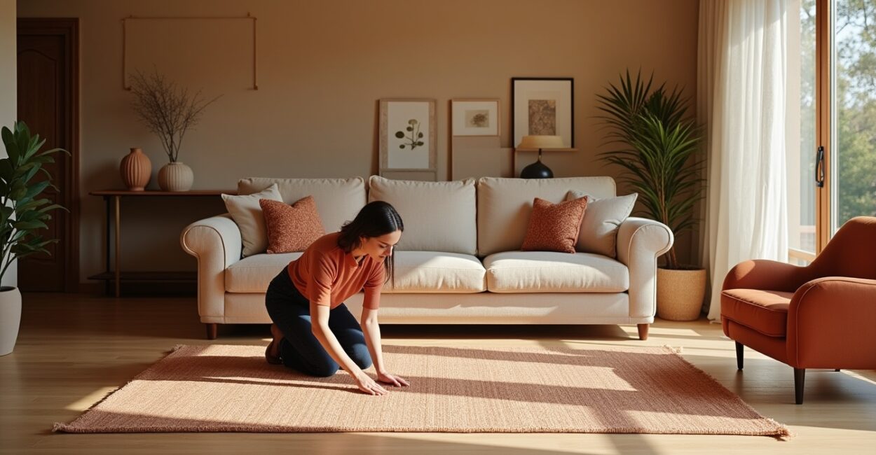
Entryway: first impressions with a terracotta rug
Try a terracotta rug in the entry for subtle update and instant warmth. It signals the season and frames the home’s welcoming tone.
Living spaces: balance and focal points
Introduce terracotta through an accent chair or gallery wall while keeping walls neutral. Use warm beige for large surfaces to avoid overwhelm.
Textiles, patterns and layering for depth
Layering textiles multiplies warmth. Think wool throws, leather details, and patterned rugs that echo the fall color palette’s organic story.
Mix scale and texture
Add a chunky knit, a patterned kilim, and velvet cushions. Varied texture creates tactile interest and visual depth in autumn schemes.
Pattern pairing strategies
Pair geometric patterns with florals or stripes, keeping colors within terracotta, beige, rust, and olive. This yields cohesion and curated charm.
| Item | Why it works | Suggested hue |
|---|---|---|
| Entry rug | Anchors the space and hides traffic wear | Terracotta or rust |
| Throw blankets | Add warmth and texture on sofas | Warm beige or mustard |
| Accent chair | Provides a focal point and seating | Olive or deep terracotta |
- Rotate throws and cushions seasonally for freshness.
- Choose washable textiles for high-traffic areas.
- Keep larger upholstery neutral to allow accent colors to shine.
Color pairing and contrast techniques
Contrast keeps a fall color palette from feeling flat. Use cool accents sparingly to make terracotta and warm beige sing with balance.
Introduce cool contrasts wisely
Small doses of deep teal or slate blue provide contrast against warm tones without clashing. Use in art or ceramics for a pop.
Use neutrals to rest the eye
Ivory, stone, and soft gray act as breathing room. Neutrals prevent visual fatigue and amplify the warmth of terracotta elements.
Styling tips that elevate resale and comfort
Smart styling makes the fall color palette feel intentional and timeless—great for personal comfort and potential buyers who value cohesion.
Stage with restraint
Limit accents to three dominant colors plus neutrals. This creates a readable, marketable look that still feels personal.
Keep functionality in mind
Select durable fabrics and practical finishes. A terracotta rug in the entry looks inviting and withstands foot traffic when chosen in the right fiber.
- Assess current palette and remove clashing colors.
- Choose one terracotta anchor piece for a focal point.
- Add warm beige on large surfaces for balance.
- Layer in two accent colors like olive and mustard.
- Fine-tune with textiles and small décor items.
Conclusion: Embrace warmth without a full makeover
Shifting your fall color palette to terracotta and warm beige offers a high-impact, low-effort refresh. A terracotta rug in the entry is an elegant, subtle starting point that signals seasonal change.
By layering textures, balancing contrasts, and prioritizing focal points, you create a home that feels both current and comfortably lived-in—just as you imagined in the introduction.
FAQ
How do I pick the right shade of terracotta for my home?
Choose terracotta by testing swatches in natural and artificial light. Consider room size: deeper terracotta suits large rooms, while muted tones work in compact spaces. Match undertones to existing wood and metal finishes to ensure harmony and lasting cohesion.
Can warm beige make a room feel bland?
Warm beige offers warmth and adaptability rather than blandness when combined with textured fabrics and accent colors. Pair it with terracotta, rust, or olive to add personality. Use varied materials to prevent monotony while maintaining a calming backdrop.
Is a terracotta rug practical for high-traffic entryways?
Terracotta rugs are practical if chosen in durable fibers like wool or indoor/outdoor polypropylene. Look for stain-resistant weaves and low pile in entryways. Maintenance and rug pads will prolong life and keep the color vibrant despite heavy use.
How many accent colors should I use with a fall color palette?
Limit to two primary accent colors plus neutrals for cohesion—terracotta and an earth tone like olive or mustard complement warm beige well. This controlled palette prevents visual chaos while allowing flexibility in décor pieces.
Where can I find inspiration and trustworthy color guidance?
Consult interior design resources like Better Homes & Gardens and Pantone for trend insights and color harmonies. Local paint stores offer sample pots for testing. Combine expert advice with your preferences to create a unique, seasonal palette.
Further reading: Explore curated palettes at Pantone and seasonal styling tips on Better Homes & Gardens. For material durability, see guidance from Houzz.